Tenant Management - AI-Assisted Usability & UI Audit → Design Iteration
As a follow-up to an existing data-management workflow, I ran an AI-assisted usability and UI audit to critically evaluate the clarity, discoverability, and scalability of the experience.
The goal was not to redesign the product with AI, but to use AI as a design tool to surface blind spots faster, pressure-test assumptions, and explore alternative interaction models within known constraints.
Phase 1: AI-Assisted Usability & UI Audit
I used an LLM (Claude AI) to conduct a structured UI and usability review of key flows, supported by my own product context and prior user feedback. The audit helped surface issues across discoverability, terminology, mental models, and bulk workflows.
Key issues identified
1. Bulk actions lacked visibility and clarity
Bulk linking was technically supported, but the entry point was not obvious
There was no clear indication of when the user entered bulk mode or how many tenants would be affected
3. Ambiguous terminology & status logic
“Not required” vs “Unassigned” was unclear:
Why would users actively mark something as “not required”?
How did this relate to progress completion?
5. Data import & editing discoverability gaps
No clear UI for previewing imported data before use
2. High cognitive load in matching & review flows
Match scores (e.g. “8/10”) lacked context:
Was this a confidence threshold or a filter?
How did it affect matching behavior?
4. Status logic
Progress bar math was technically correct but conceptually unclear:
“Completed” was interpreted as “linked” rather than “reviewed / managed”.
6. Review & source comparison lacked affordances
Inline editing and post-import edit affordances were not obvious.
Conflicts
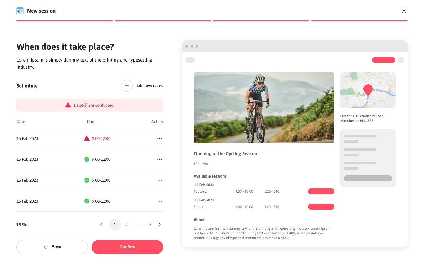
Expandable multi-source columns were not discoverable - I had included a entry point at top to switch the widget and columns had a chevron to show its expandable but not picked up by AI
Understanding hierarchy levels (roles) - in the design i changed the labels intentionally but the generic terms caused ambiguity so I changed the terminology and added details not overlapping with the original context in the product
No clear indication of how many tenants would be affected, and what actions would apply en masse? - the widget header mentioned ‘Managing 4 Unassigned tenants’ explaining the actions would only affect unassigned tenants
Iteration Highlights
Initial versions focused only on individual review → rejected
Row expansion approach explored → rejected
(did not solve the core bulk-preview problem)Side bar with list view of details or and required clicking next to review each one by one which defeats the purpose of reviewing en-masse. While it optimises space its not efficient
Popup-based review model introduced:
allowed side-by-side source vs imported data and colour + icon indicators for easy differentiation
enabled “apply to all” actions
surfaced data origin clearly
quick entry point with icons in the grid too
This took ~6–7 targeted prompts to reach a usable interaction model.
Other edge cases identified
Error prevention for marking tenants as match not found or private
Entry points and dedicated actions based on each filter
Success toasts and feedbacks
Iteration Highlights
Similarly, the matching flow was iterated to:
introduce a confidence threshold with explanation
allow system-assisted bulk matching
reduce terminology ambiguity and changed terms to private and match not found. also for confidence threshold
allowed assigning these statuses en-masse with proper error prevention by introducing a confirmation modal
remove unnecessary or confusing filter states (e.g. “pending”) with dedicated actions under each
For import data:
preview was introduced to provide clarity on available data and allow importing after review to build user trust
help text
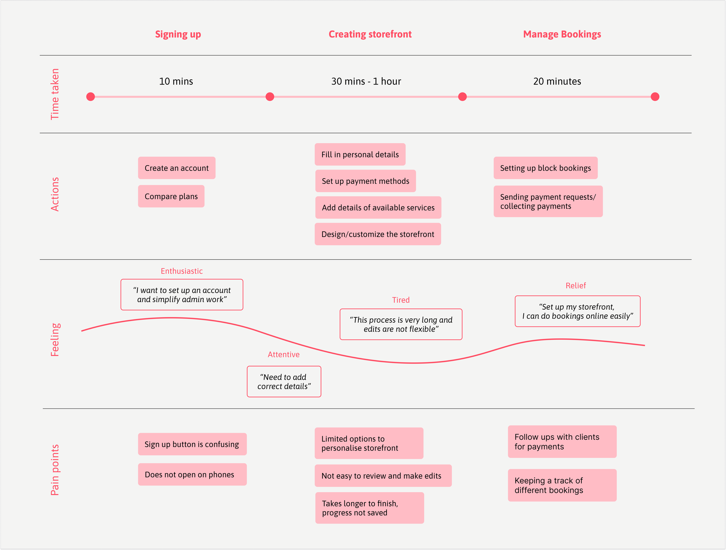
Uncovering Friction: Barriers to a Smooth Start
After initial user interviews, analytics helped quantify user friction and validate key pain points.
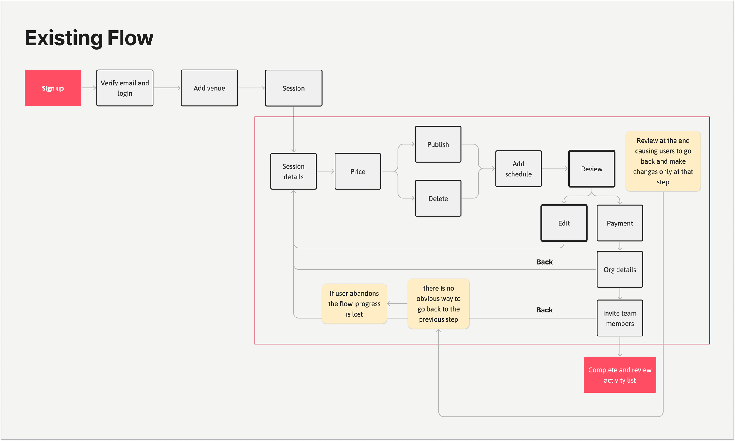
Overwhelming flow – 67% of users struggled with too many unclear steps.
Rigid navigation – Users couldn’t go back without restarting, increasing frustration.
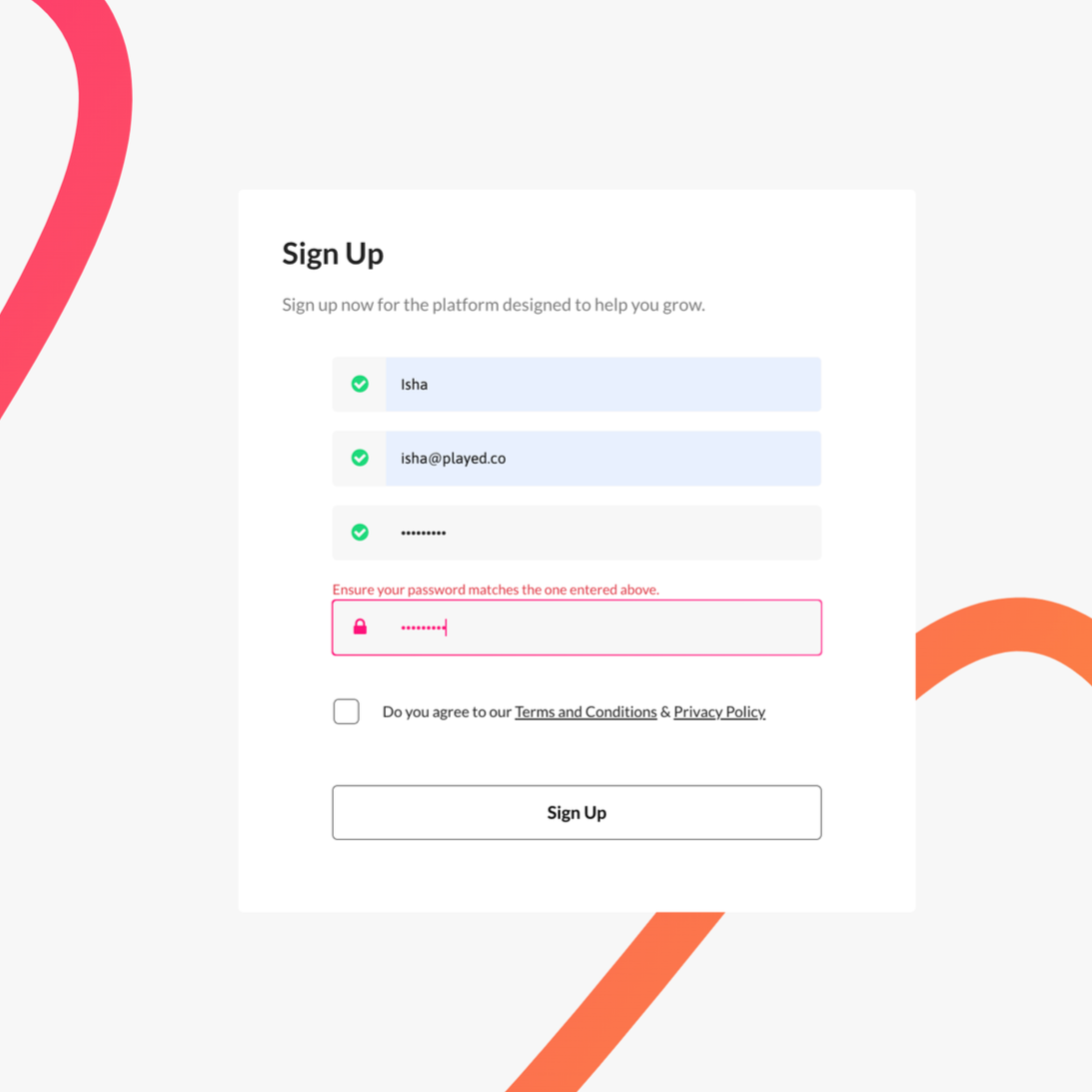
Sign-up errors – 79% of sessions failed due to hidden password inputs.
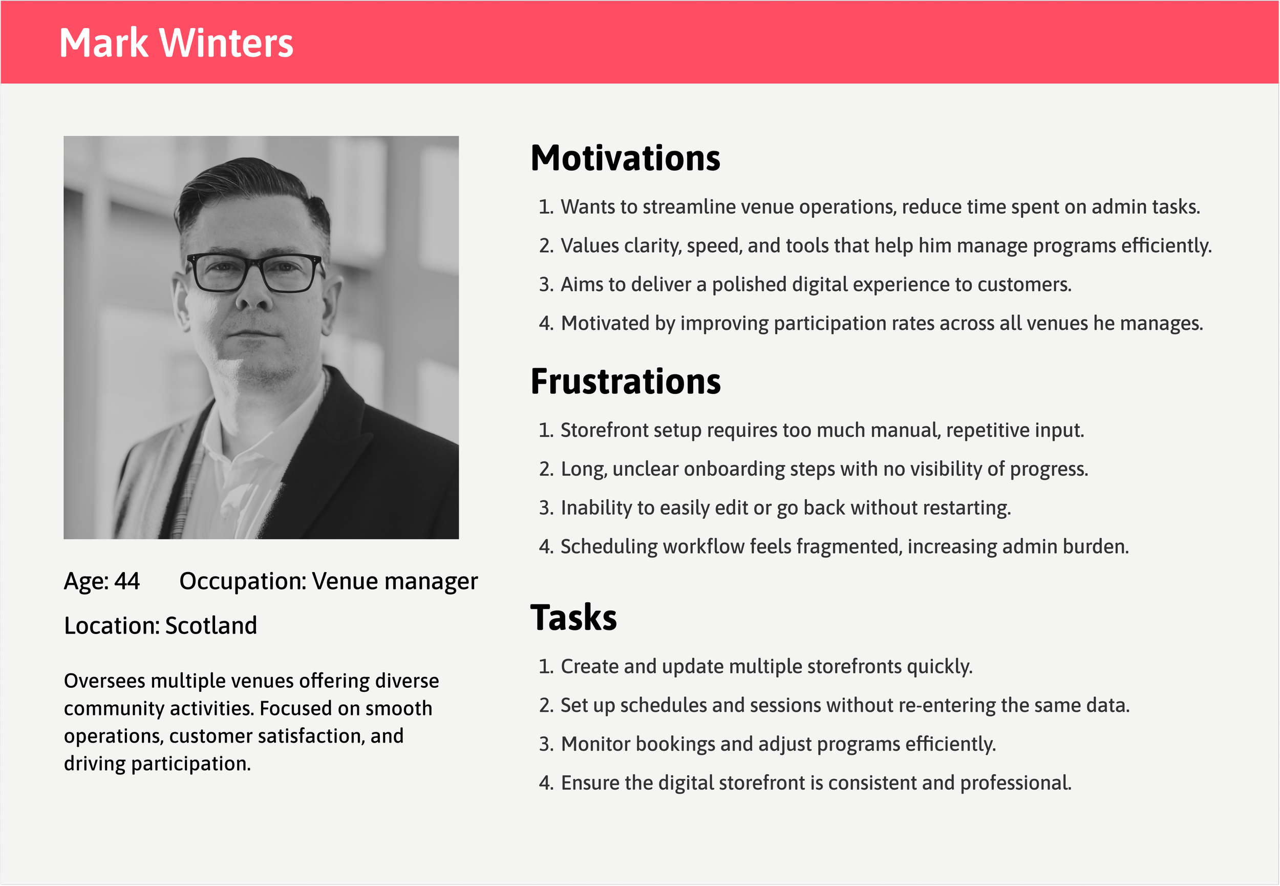
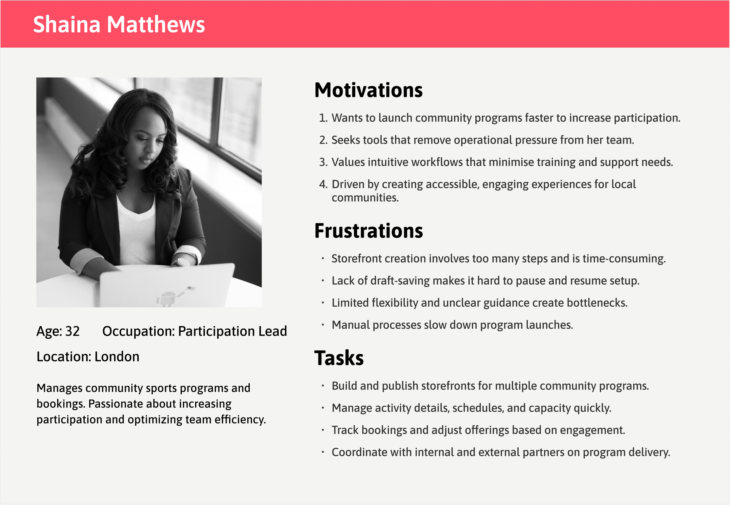
How personas shaped the solution
From the user research — two core personas emerged: a time-strapped venue manager juggling multiple storefronts, and an efficiency-focused participation lead aiming to boost engagement with limited resources. Their shared frustrations around time-consuming storefront setup, manual workflows, and limited flexibility highlighted the need for a faster, clearer onboarding experience.
These insights directly informed the design objectives — to simplify setup and reduce cognitive load.
Problems:
Quick setup without commitment (30-60 min was too long)
Ability to save progress and return later
Solution:
Introduced auto-save and flexible exit points
Problems:
Efficient creation of multiple storefronts in fewer steps
Clear progress visibility across activities
Solution:
Added progress tracking and preview/review steps
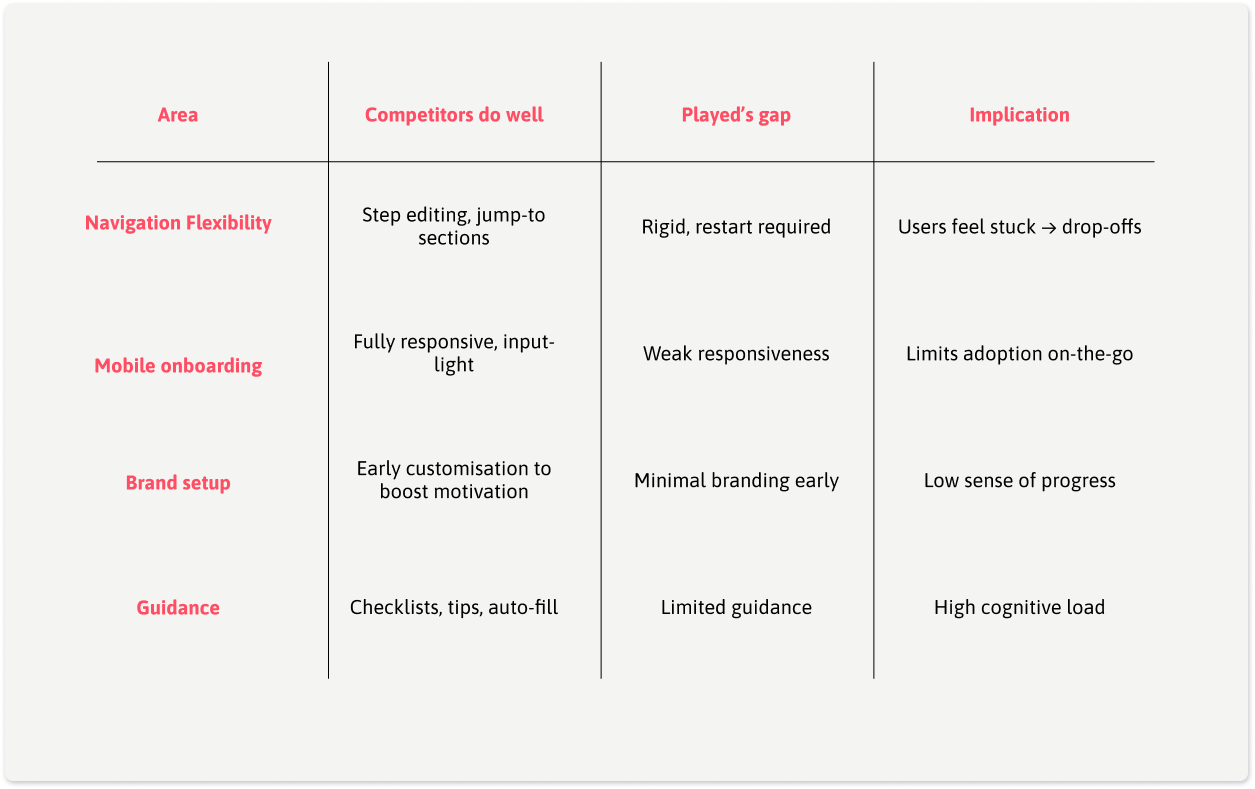
Competitive Insights
What Competitors Did Well:
Playtomic: Excellent mobile experience with progress saving
Clubspark: Flexible navigation allowing users to edit
Bookteq: Strong customization options
Where Played Was Falling Behind:
Rigid linear flow vs. competitors' flexible navigation
Poor mobile experience (critical for on-the-go providers)
Limited storefront customization options
Design Strategy: Focus on Flexibility
By linking user, business, and market insights:
Streamlining storefront setup emerged as the highest-impact opportunity to strengthen the flywheel — improving UX → boosting conversions → enabling customer growth and more referrals.
By focusing on flexibility and mobile-first design, Played could differentiate in a crowded market while solving its #1 conversion bottleneck. While customisation preferences would be updated over time based on user feedback and adoption.
Streamline onboarding flow — Reduce setup time and cognitive load by simplifying steps and guidance.
Increase flexibility — Allow users to navigate back and edit inputs without restarting the process.
Enhance clarity and feedback — Improve form validation, visibility of inputs, and progress indicators.
Boost completion and adoption — Encourage storefront creation through a smoother, faster, and more intuitive experience.
Aligning user flow to accommodate flexibility
The revised user flow introduced flexibility with clear entry and exit points, allowing users to resume setup where they left off. Smaller milestones maintained motivation and reduced cognitive load, whereas and a review window improved clarity, and enhanced efficiency — ultimately reducing drop-offs.

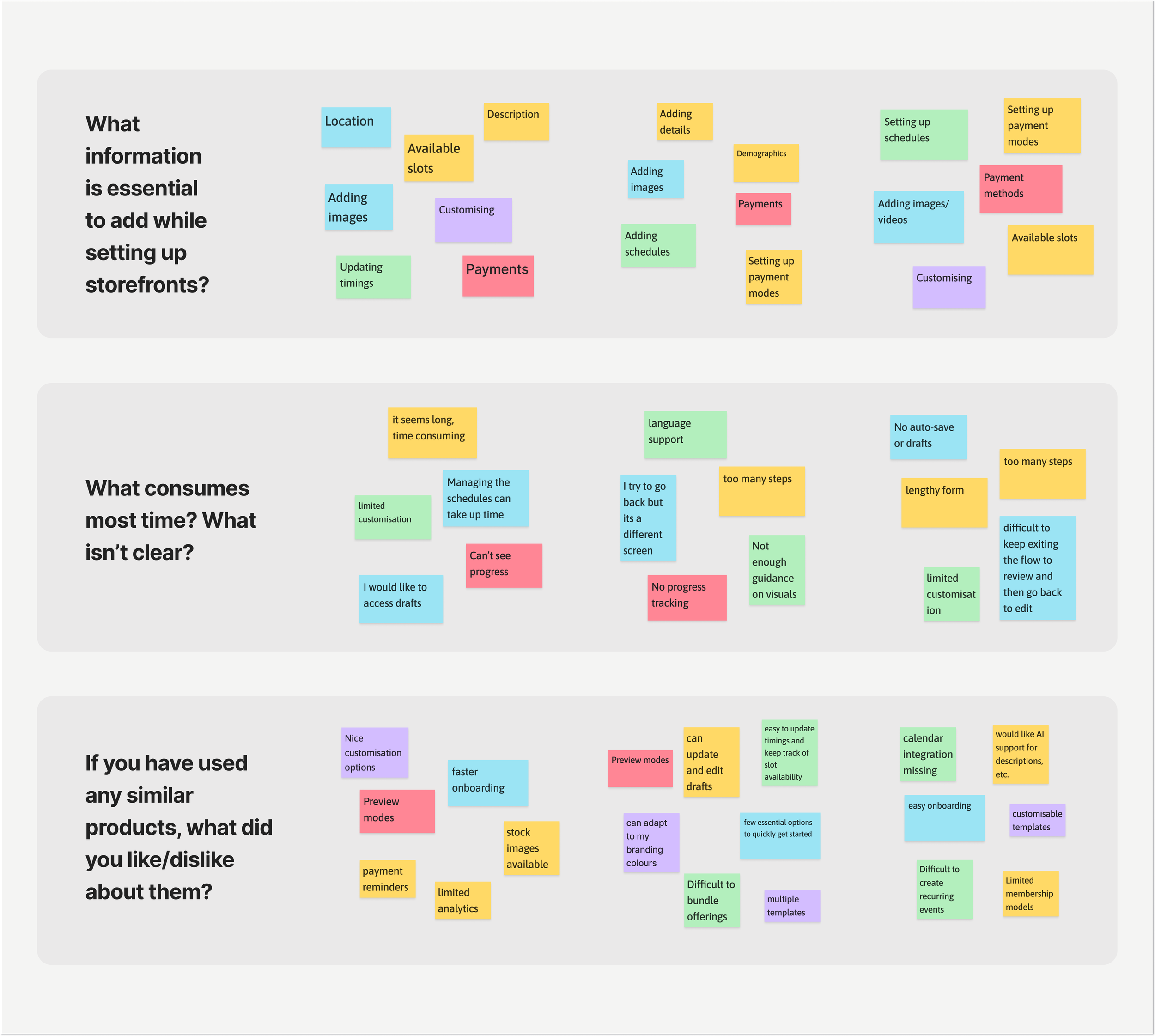
Translating Research into Solutions
Research findings were translated into design actions that improved clarity, confidence, and motivation

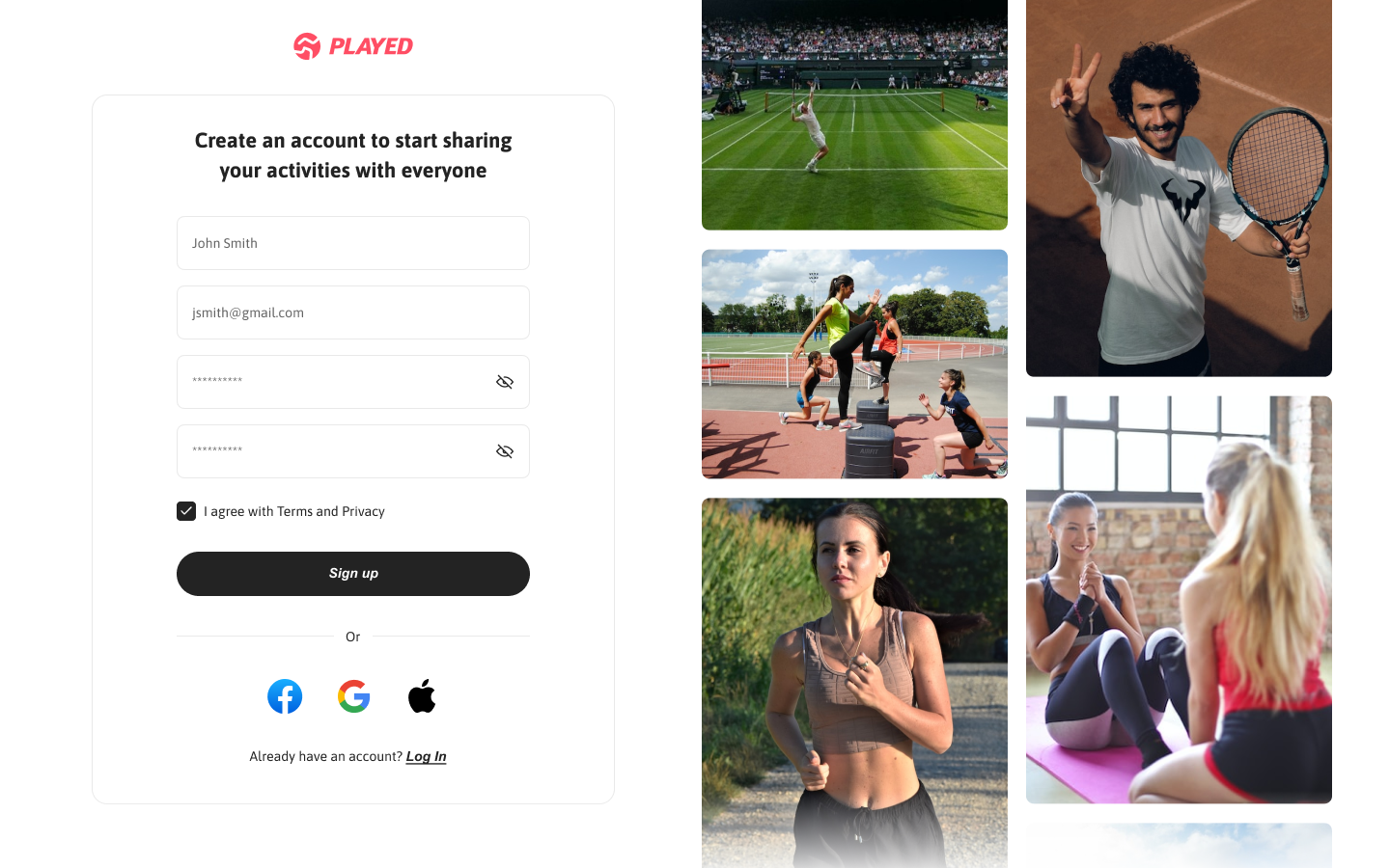
Enhance sign-up process by allowing password visibility, adding social sign-in options, and improving microcopy to reduce errors.

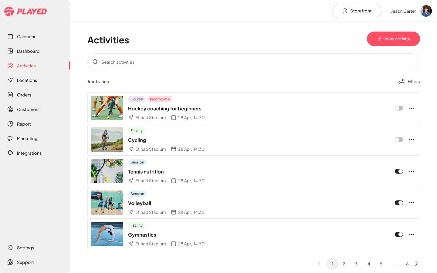
Adding a progress section on the top left of the Activities page will help users to easily navigate back to where they left off, avoiding frustration.

Implementing success screens after completing key onboarding steps will provide positive reinforcement to users and avoid abandoning flow.

Adding a preview section to help users confirm their selections and make changes, reducing overall time in decision-making and speeding up the onboarding process
Screens and interactions
The design was built using a newly established design system, featuring a refreshed color palette and visual language that strengthened brand identity while supporting key UX improvements across devices.


Users can save and continue journeys as needed, reducing cognitive load.
Users have the flexibility to go back to previous step and make quick edits.
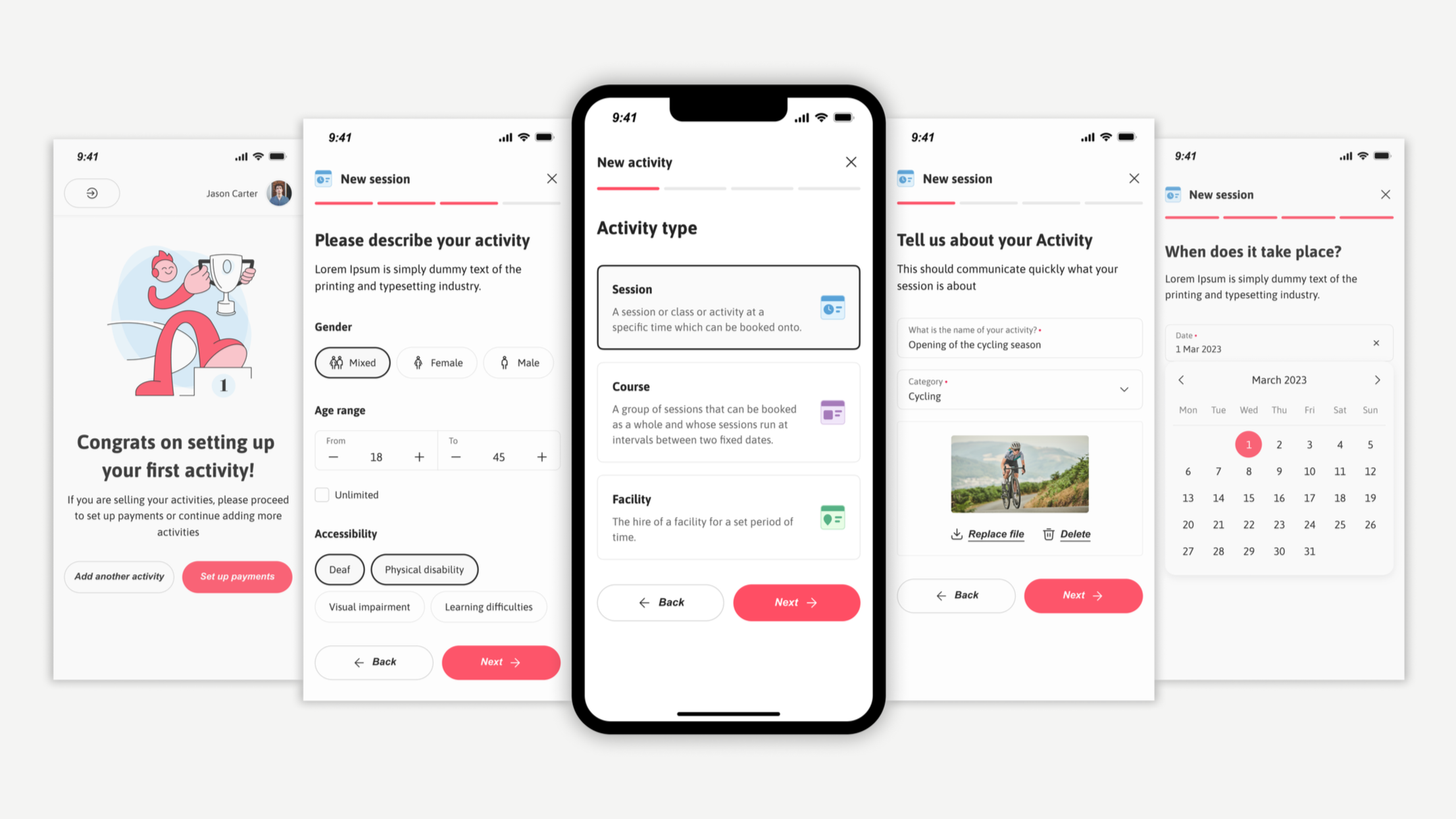
New design system also enabled us to account for responsiveness and make improvements in the mobile experience.
Validating the solution
Testing Approach: Conducted usability testing with 8 providers (4 venue managers, 4 participation leads) using interactive prototypes.
Key Findings:
Setup time reduced from 30-60 min to 15-20 min average
100% of users successfully navigated back to edit inputs
Sign-up error rate dropped from 79% to under 10% in testing
Impact and Outcomes
The combination of streamlined flows, clearer feedback points, and stronger visual consistency proved effective in reducing drop-offs and encouraging adoption. Through usability testing and analytics tracking, key metrics showed clear progress at the end of 1 quarter from launch:
12% ↑
conversion rates
Users completed storefront setup faster and stayed more engaged during the onboarding flow
20% ↑
user satisfaction
Task success scores improved which was identified by in-app surveys and qualitative interviews reflecting a smoother, intuitive journey.
25% ↓
error rates
Users were able to sign up quickly and there was low abandonment during the process.
Key Learnings & Next Steps
The combination of streamlined flows, clearer feedback points, and stronger visual consistency proved effective in reducing drop-offs and encouraging adoption. Through usability testing and analytics tracking, key metrics showed clear progress at the end of 1 quarter from launch:
What Made This Successful:
Journey mapping revealed the exact bottleneck (storefront creation), allowing focused effort on highest-impact area
Balancing flexibility with guidance — users needed both freedom to navigate and clear next steps
Mobile-first thinking was critical for providers who manage activities on-the-go
What I’d Do Differently:
Test earlier — we could have caught some usability issues sooner with lo-fi prototypes
Run deeper segmentation by separating first-time users from returning admins to better tailor onboarding paths.
Test mobile-first flows parallely to ensure consistency and reduce late-stage compromises.
Future Opportunities:
Smart defaults based on activity type (reduce input fields)
Template library for common storefront types - Progressive onboarding (get users live faster, add details later)
Integration with existing booking systems (reduce manual entry)