Designing Clarity: Rethinking the Calendar for Everyday Efficiency
Role: User Experience Designer
Skills: UX Design, User research, Journey Maps
Timeline: April-June 2023
Why This Problem Mattered
Played helps sports and activity operators manage their day-to-day work—from scheduling sessions to handling customer bookings. As part of a broader platform redesign, we revisited core workflows to understand where users were struggling.
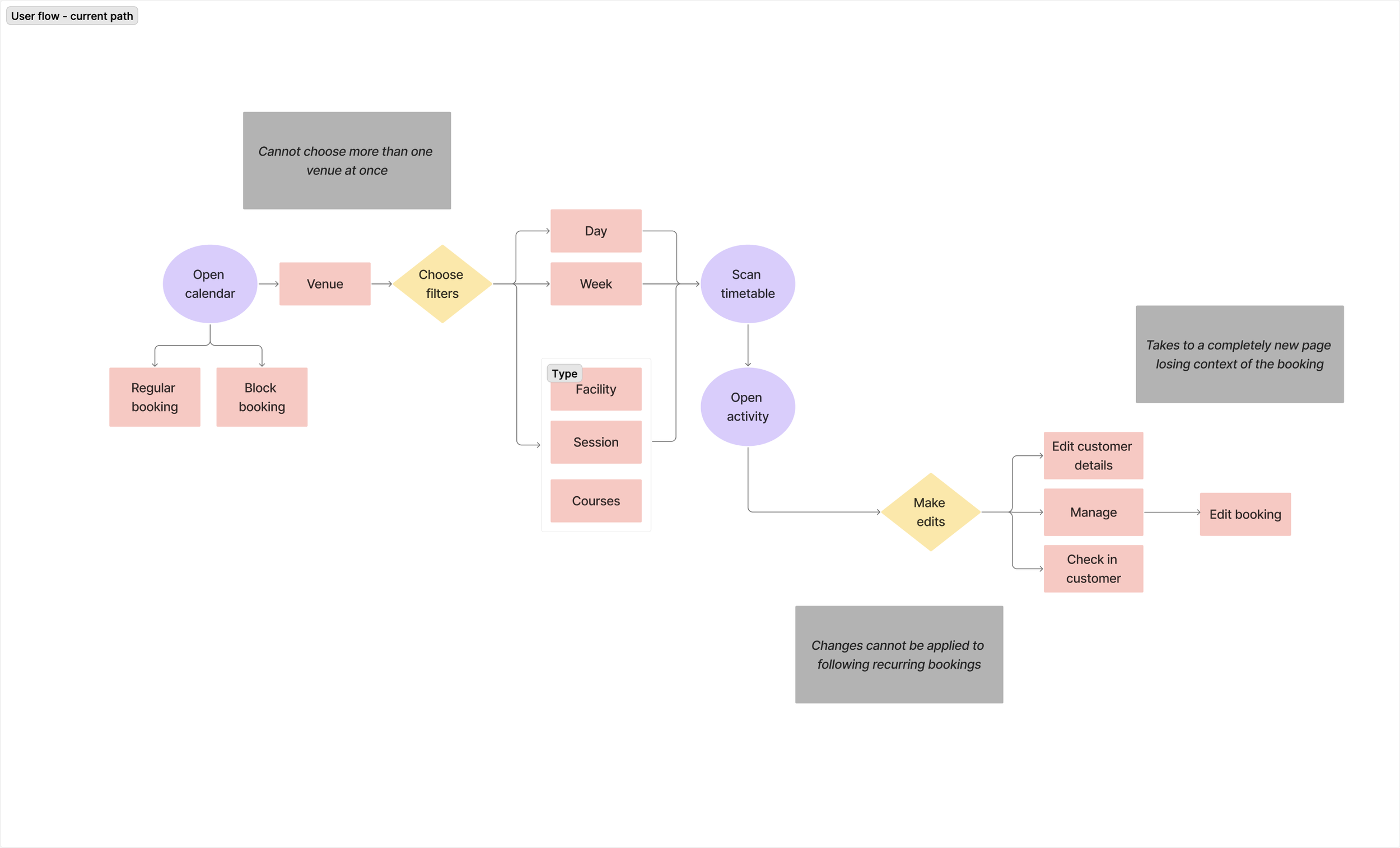
Research quickly showed that booking sits at the centre of daily operations for both large facilities and small studios. Almost every task led back to the calendar. Yet the experience made it hard to filter schedules, understand what was coming up, or make quick updates.
From a product perspective, this area was also closely tied to key business requirements—reducing time spent on admin, improving session fill rates, and supporting both high-volume and low-volume operators within a single experience. Because booking directly impacts operational efficiency and revenue, improving this workflow became a high-priority initiative for the redesign.
Understanding Real-World Booking Behaviour
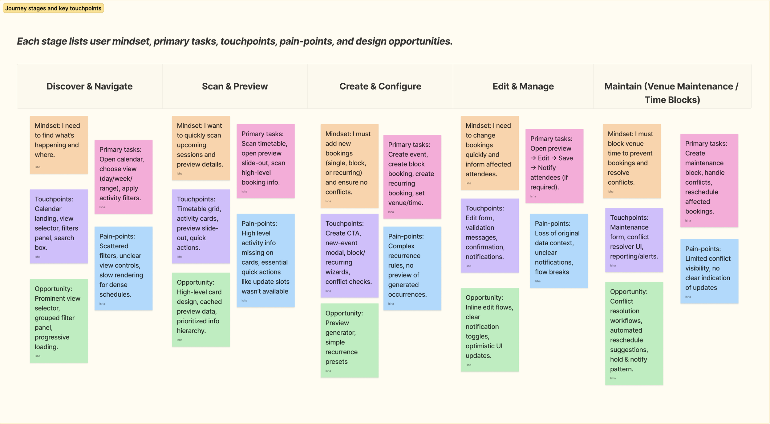
To improve the usability of the Calendar, I began by grounding myself in real user behaviour. Through a combination of 5 user interviews, user behaviour tracking, and competitive benchmarking, I focused on understanding what core tasks users needed to accomplish daily.
The research revealed three interconnected dimensions:
Daily operational tasks
Filtering sessions, previewing upcoming bookings, creating or editing new ones.Two distinct user groups
Large customers juggling multiple venues and activities vs. smaller teams with limited resources.UI/UX rationale
A need for clearer information hierarchy, optimised layouts, and intuitive controls.
Where the Experience Was Breaking Down
Based on interviews and user behaviour analytics, following pain-points were identified
Low visibility
Missing or buried information made it hard to understand availability, conflicts, and booking details.
No quick actions
Common tasks like updating slots, editing times, checking conflicts, notifying attendees required too many steps.
Scattered controls
Filters, actions, and view toggles weren’t grouped logically, slowing users down.
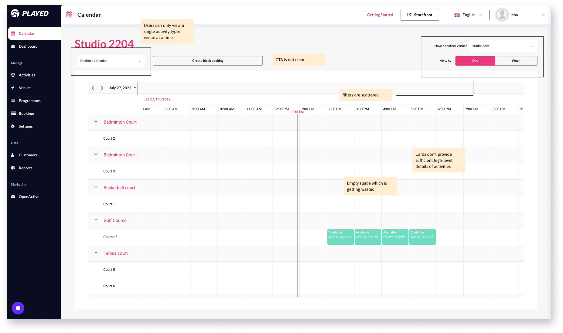
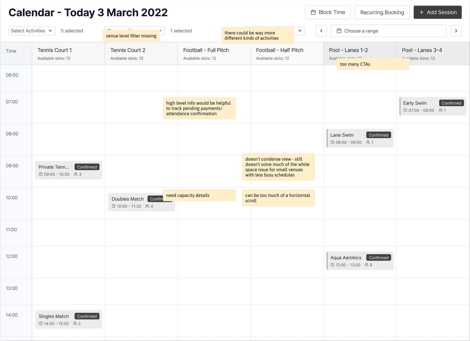
Auditing the Existing Calendar UI
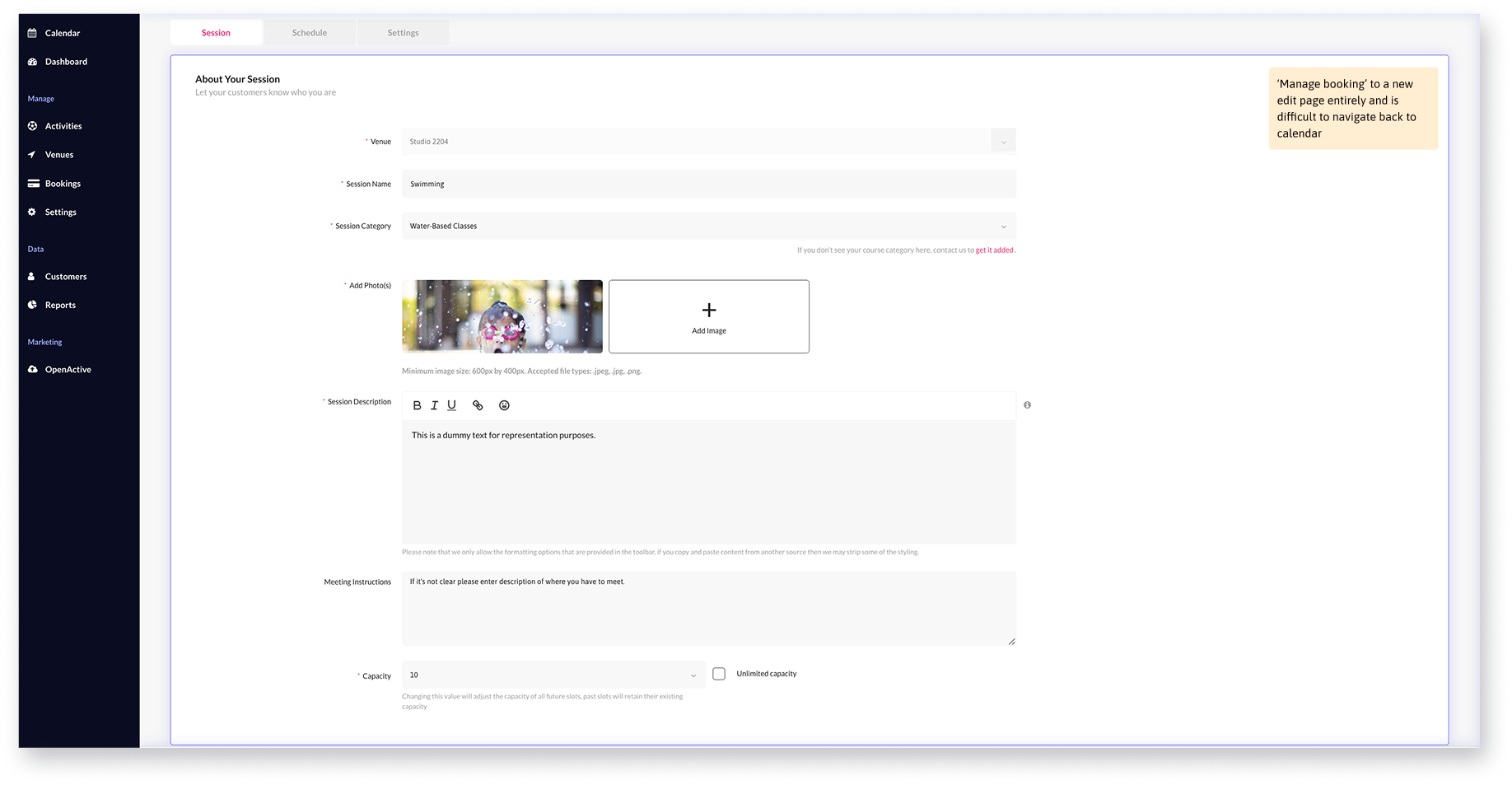
Unclear CTA placement, complicating key workflows like creating new bookings.
Excessive empty space, especially for days with no availability.
Limited activity view, forcing users to view one activity type at a time only.
Scattered filters, disrupting scanning flow and reducing discoverability.
Revisiting the Booking Journey to Reduce Steps and Friction
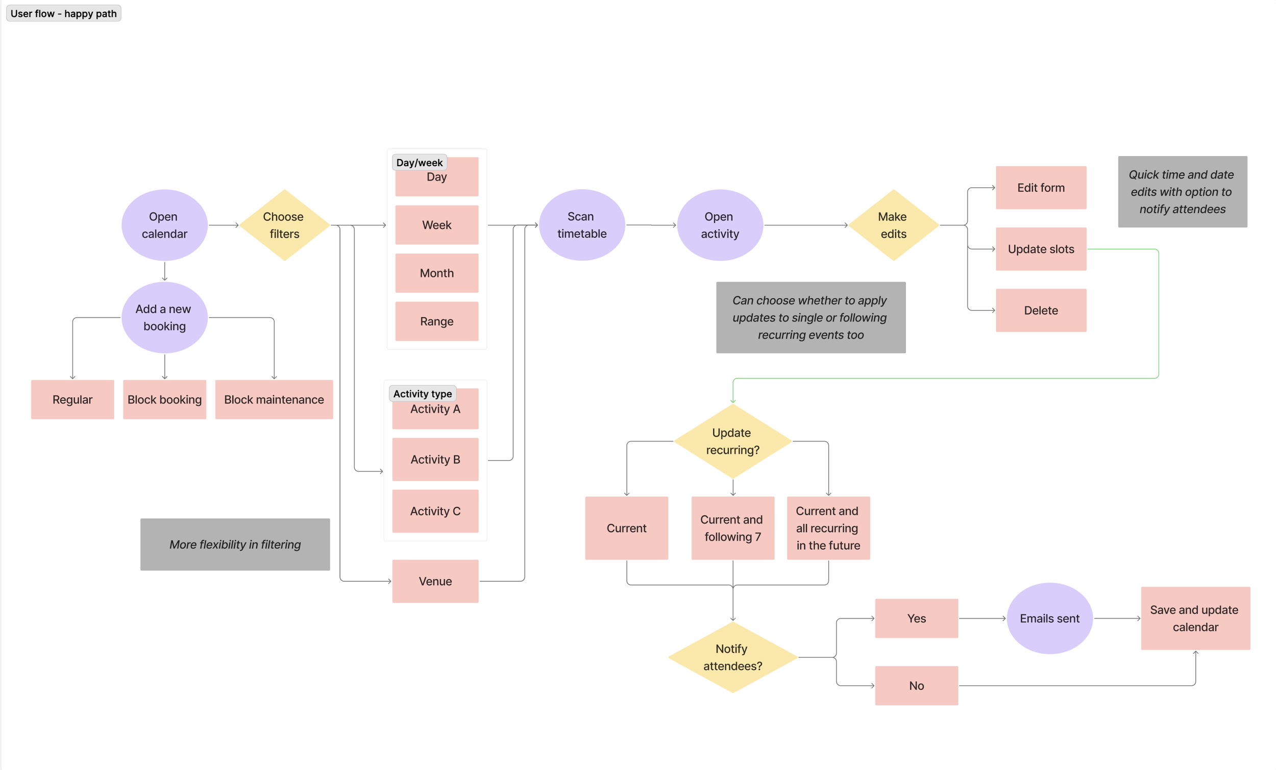
Based on the friction points identified across the user journey, a few areas stood out as immediate opportunities for improvement. These included stronger filtering to help users quickly narrow down busy schedules, and quicker in-flow actions such as sending reminders or applying updates to future recurring sessions. Addressing these gaps would reduce unnecessary steps, support faster decision-making, and save time in high-frequency workflows.
Competitive benchmarking reinforced these findings. Leading scheduling tools consistently offered customisable views by time period or layout, richer event cards, built-in reminders and notifications, and flexible ways to edit or update bookings. Taking these patterns into account, and tailoring them to the specific pain points uncovered in our research, I explored two initial concepts for the calendar redesign.
Exploring Two Early Concepts
Idea 1: Prioritising Speed Through Dense Information
What worked
Filters grouped in a single row made scanning and refinement faster.
Date range selection felt intuitive and useful for planning ahead.
Expanded views surfaced helpful high-level information.
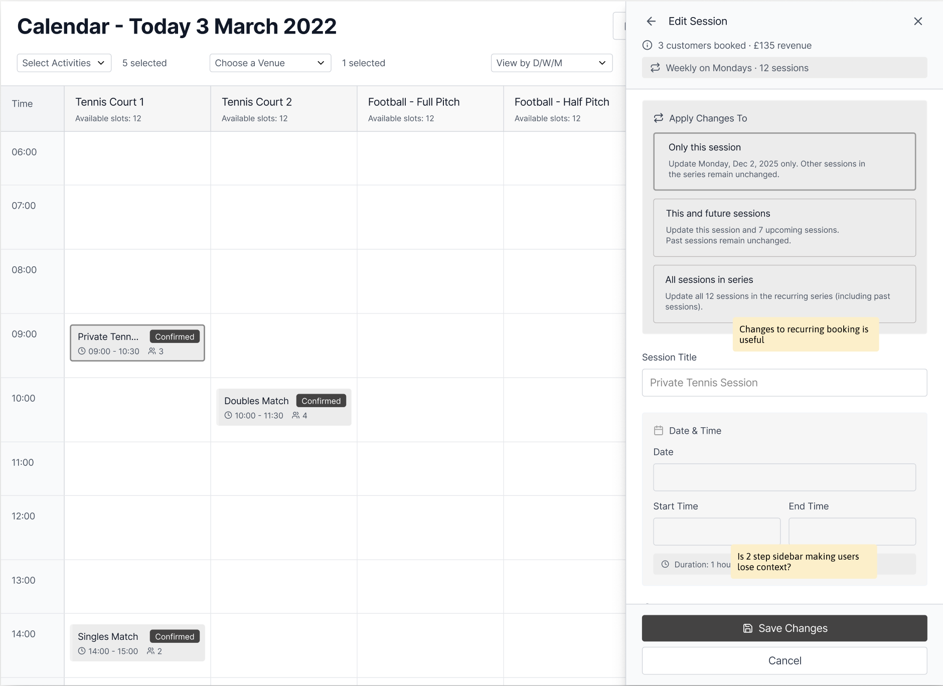
Ability to apply updates at a recurring level was useful.
What didn’t
Heavy horizontal scrolling reduced visibility.
Participant counts lacked clarity (e.g. unclear if 4/12 or 4/16 meant occupied vs available).
Layered sidebars risked users losing context while editing.
Save behaviour was ambiguous—users weren’t sure if they’d return to the overview or exit the flow.
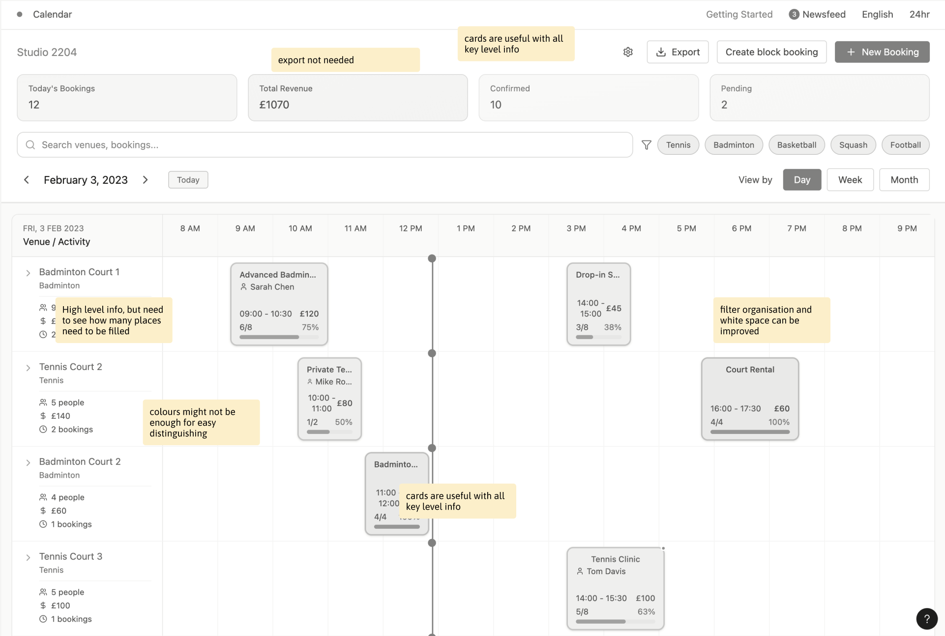
Idea 2 - Prioritising Clarity Through Structured Views
What worked
Day/week tabs with quick filters were helpful to customise views.
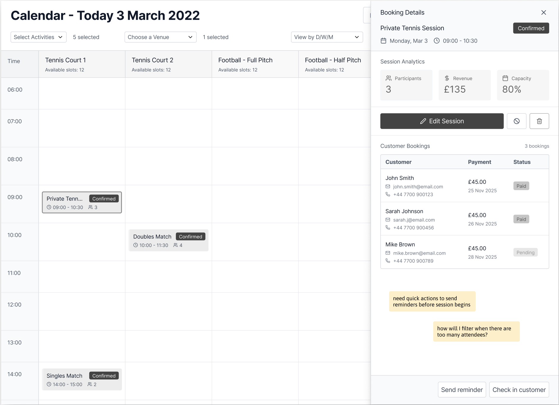
Capacity information was clear and very useful especially when managing attendance.
High-level activity details worked better at a deeper, session-level view.
What didn’t
Export was not perceived as a meaningful or frequent action.
High-level summary cards consumed too much space at the calendar level.
Revenue and booking metrics felt more relevant at an individual session level rather than in the overview.
Paid status filtering was missing, limiting usability for larger attendee lists.
Defining the Final Direction
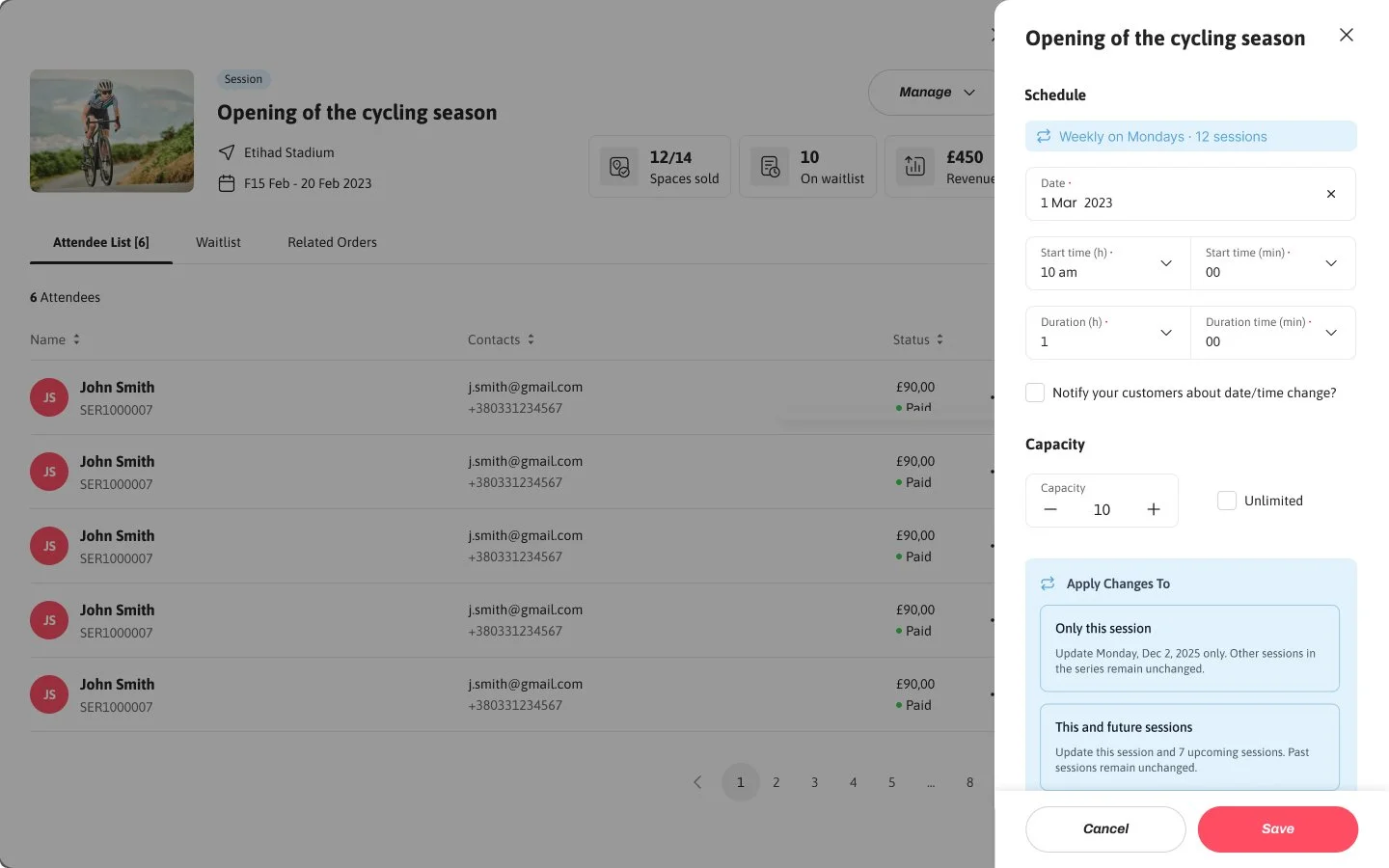
Users needed a quick way to understand what was coming up so they could actively optimise space. To support both busy and low-volume schedules, an alternate list view was introduced, combining learnings from earlier explorations—reducing visual noise, improving capacity clarity, and retaining context while editing. Also, early collaboration with engineering helped validate which ideas could scale technically, especially around recurring bookings and in-flow edits. This feedback was key in refining the concepts and shaping a solution that balanced user needs with feasibility.
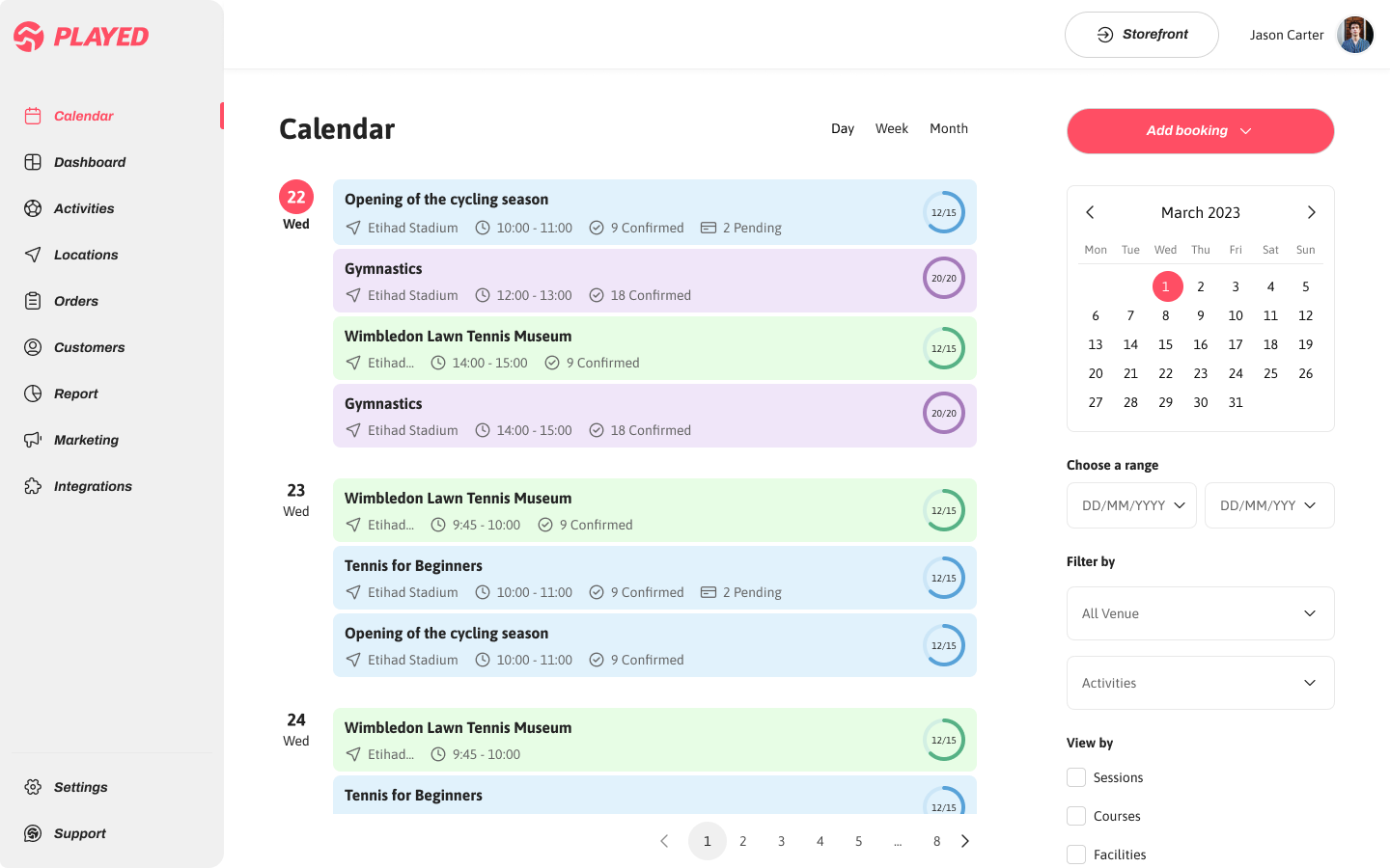
Capacity as the Primary Signal
A filled radial indicator was introduced to clearly communicate how full each session is, helping users instantly prioritise which activities need attention.
Dedicated Filter System
A dedicated filter panel enables quick refinement by day, week, date range, activity type, and individual activities—supporting both high-level planning and detailed management.
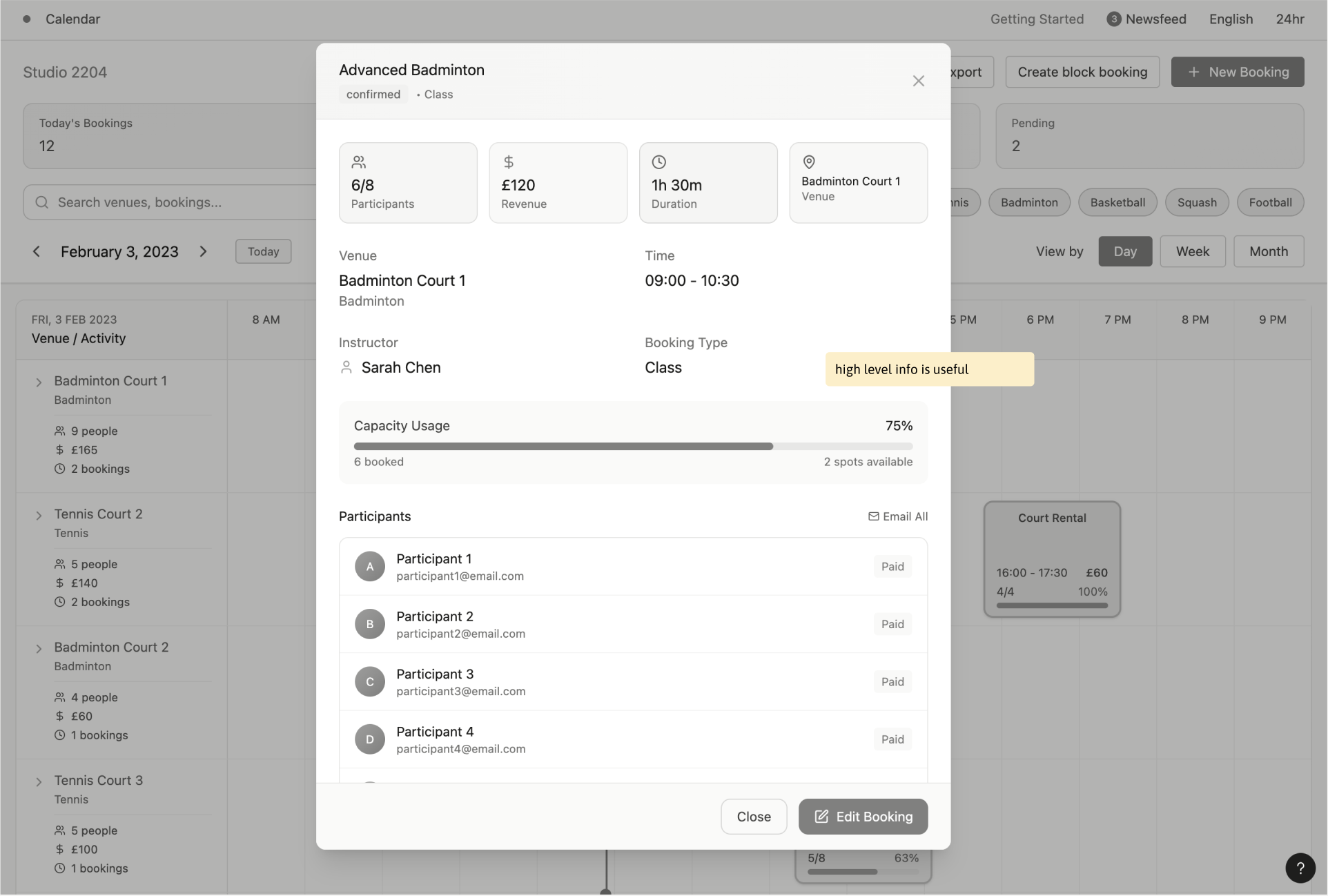
Improved Preview Sidebar
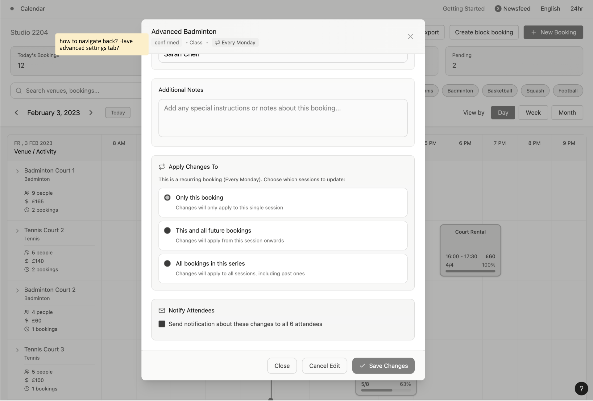
The preview overlay was redesigned to allow slot edits, payment checks, and attendee updates without pulling users out of their current view, reducing errors and improving confidence.
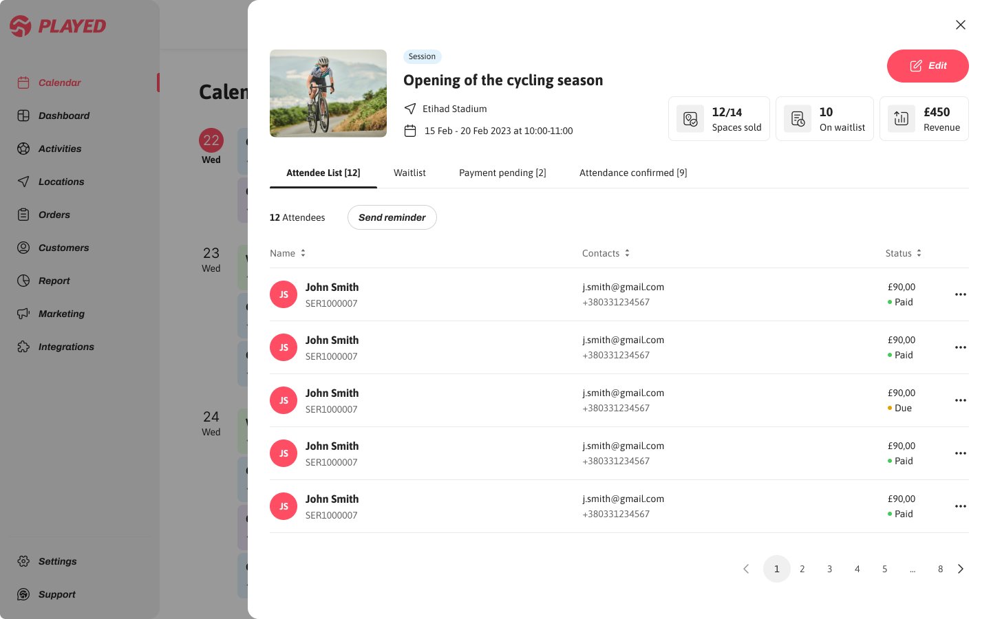
Filtering activities
Edit and notify attendees
Send reminders
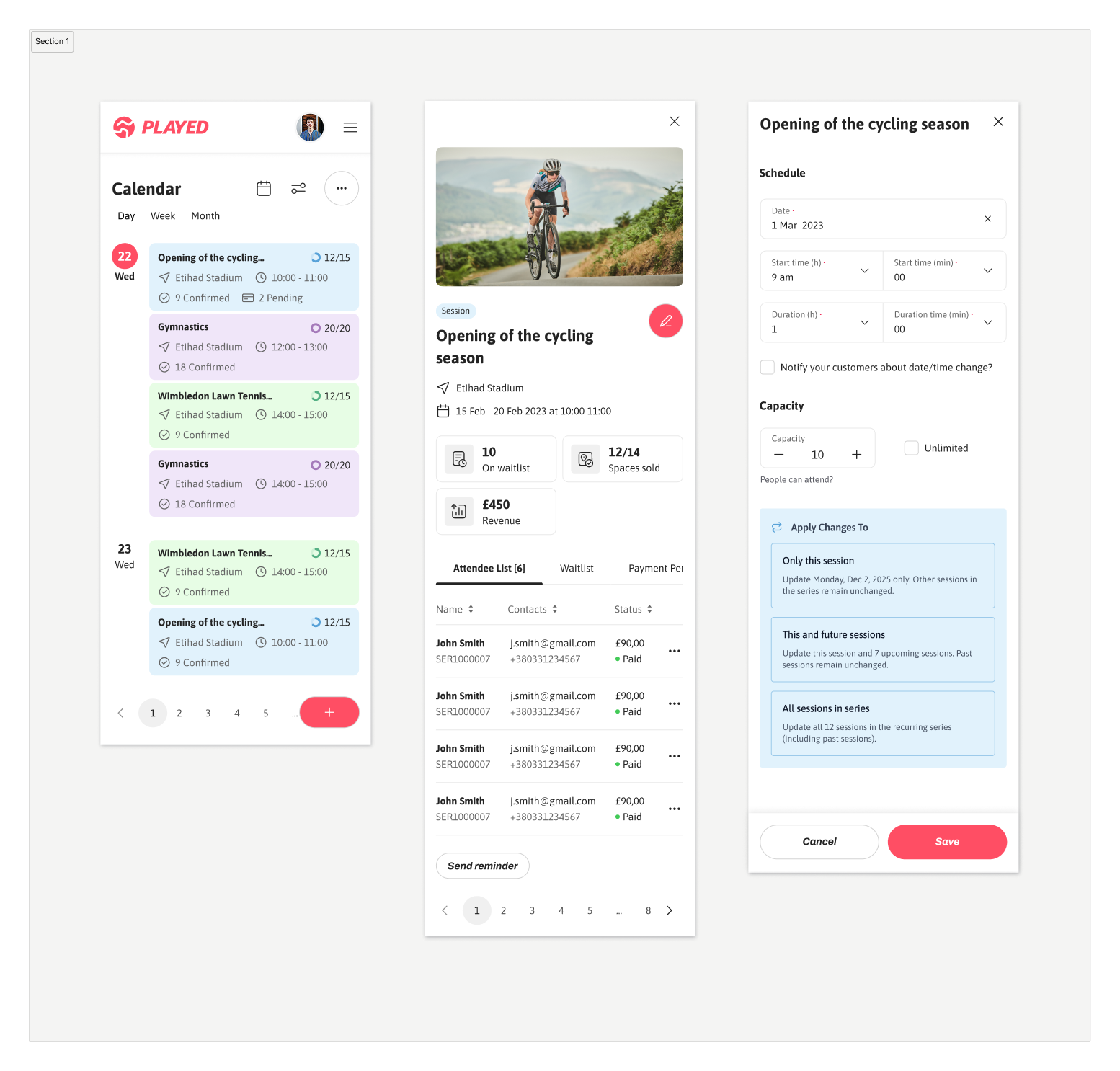
Mobile versions
Impact on Efficiency, Accuracy, and User Confidence
Following the launch of the redesigned calendar and booking experience, we measured both qualitative and quantitative signals to understand its impact on user efficiency, confidence, and operational outcomes. These outcomes were measured through moderated usability testing, task-based time tracking, and post-launch product analytics comparing behaviour before and after the redesign, supported by user surveys.
35% ↓ time
To find underfilled sessions
enabling operators to spot gaps faster and optimise space more effectively.
35%↑
task completion
showing clearer previews and safer editing reduced operational errors.
45% ↑
user satisfaction
reflecting higher confidence and ease when managing sessions and recurring bookings.
What I Learned & What I’d Explore Further
This project deepened my understanding of how to balance competing user needs—designing for both high-volume operators and quieter schedules without over-optimising for one at the expense of the other. Breaking away from a rigid grid layout into a more flexible, card-based system helped prioritise capacity and status as primary signals, directly supporting our success metrics through iteration.
Given more time, I would have explored a dedicated conflict-resolution flow which surfaced during testing but were constrained by technical dependencies and timeline trade-offs during the broader platform redesign. Exploring it further could unlock even greater efficiency for power users managing complex schedules.