UX Improvements That Drive User Action: Optimising Onboarding for Higher Conversions
Role: User Experience Designer
Skills: User research, UX audit, Wireframes, Customer Journey Map, User flows
Timeline: January - March 2023
The problem - Rigid onboarding flow hindered completion
Played is a sports participation platform that helps providers create digital storefronts to host activities, manage bookings, and track performance. However, the existing onboarding experience was rigid and time-consuming, making storefront setup difficult and reducing conversions.
Why it mattered for Played?
Played's business model depends on provider activation. Every incomplete onboarding means:
Lost revenue (no storefront = no bookings)
Wasted acquisition costs
Missed network effects (fewer providers = less value)
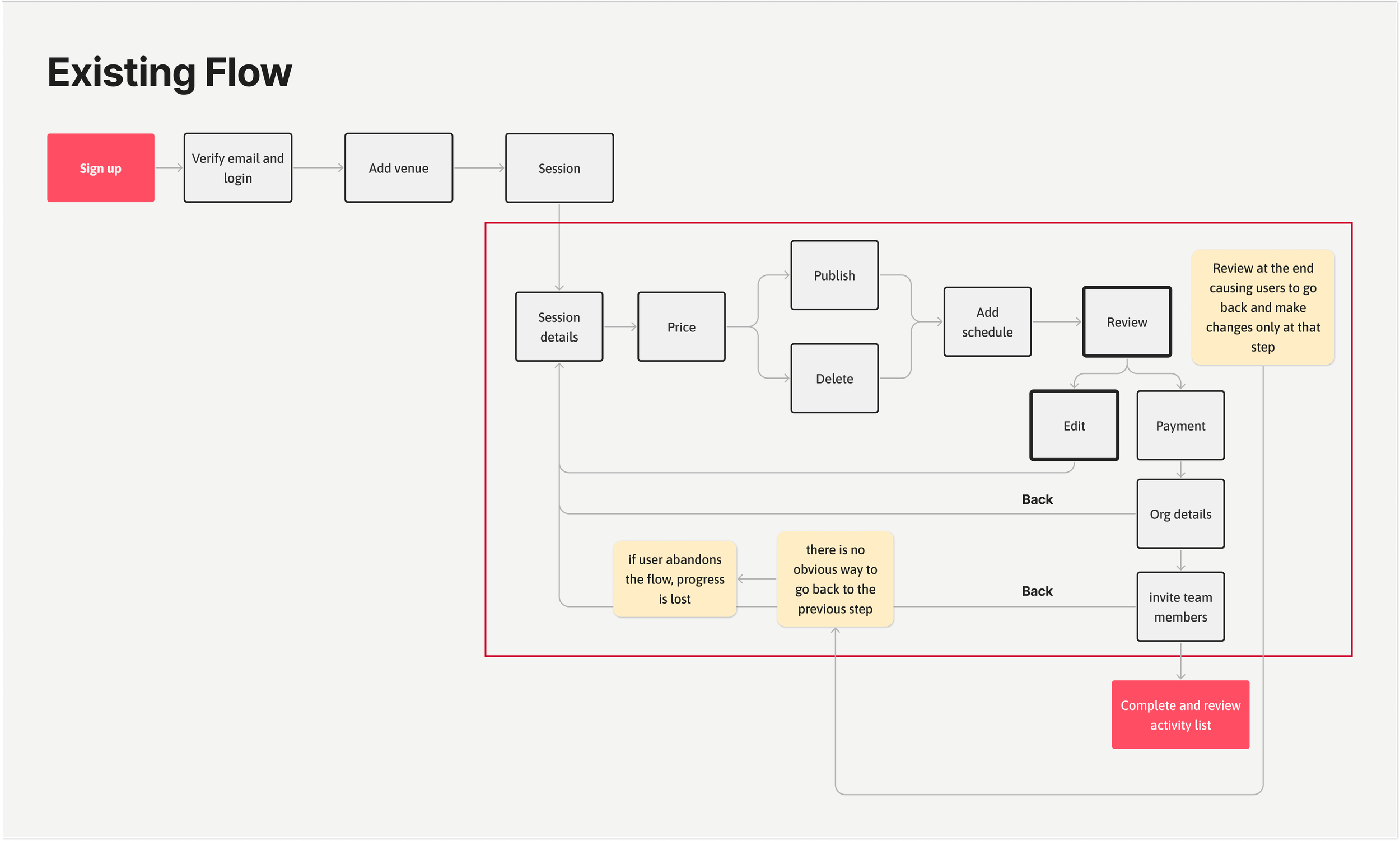
Discovery - identifying friction points in the journey
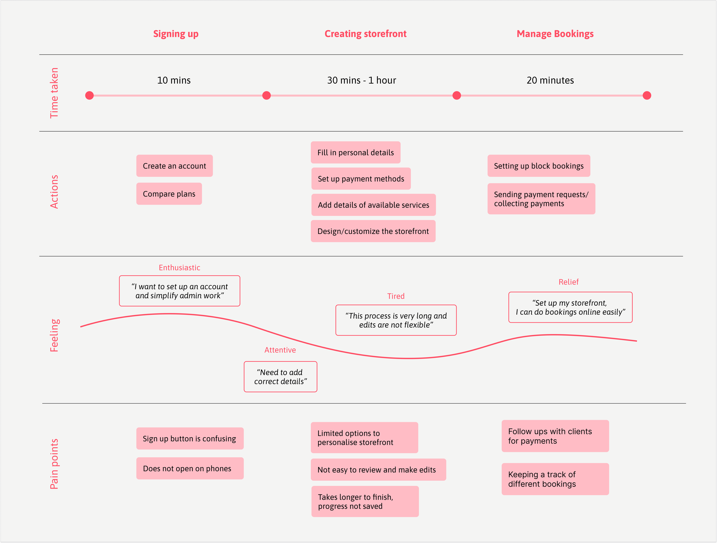
Conducting interviews with users and journey mapping revealed that the storefront creation phase was the biggest bottleneck in the overall onboarding experience. Sports providers were spending 3x longer than any other stage leading to frustration and abandonment.
From the journey map, users spent 30 mins–1 hour creating storefronts — significantly longer than any other stage.
Emotional mapping showed a clear dip in engagement during this stage: users felt the process was “very long” and “not flexible.”
Pain points like no auto-save, too many steps, and limited customization directly contributed to fatigue and drop-offs.
Uncovering Friction: Barriers to a Smooth Start
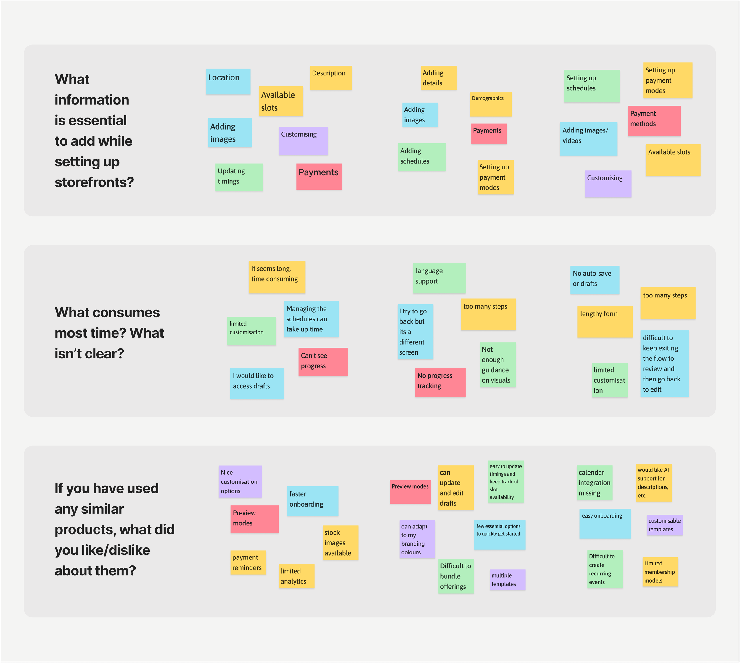
After initial user interviews, analytics helped quantify user friction and validate key pain points.
Overwhelming flow – 67% of users struggled with too many unclear steps.
Rigid navigation – Users couldn’t go back without restarting, increasing frustration.
Sign-up errors – 79% of sessions failed due to hidden password inputs.
How personas shaped the solution
From the user research — two core personas emerged: a time-strapped venue manager juggling multiple storefronts, and an efficiency-focused participation lead aiming to boost engagement with limited resources. Their shared frustrations around time-consuming storefront setup, manual workflows, and limited flexibility highlighted the need for a faster, clearer onboarding experience.
These insights directly informed the design objectives — to simplify setup and reduce cognitive load.
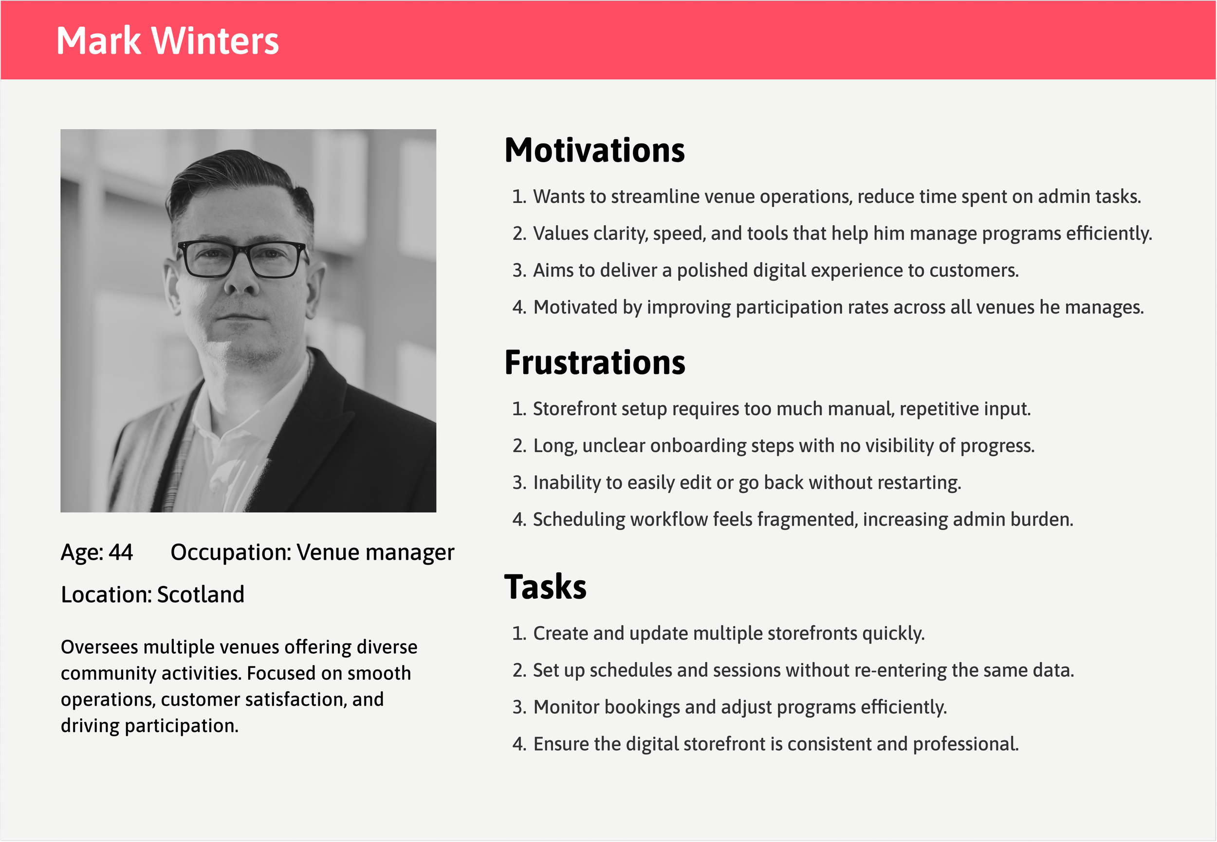
Problems:
Quick setup without commitment (30-60 min was too long)
Ability to save progress and return later
Solution:
Introduced auto-save and flexible exit points
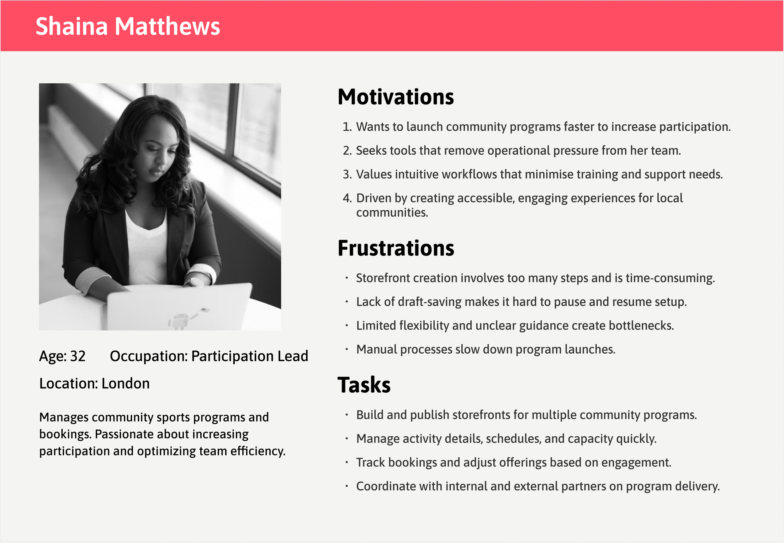
Problems:
Efficient creation of multiple storefronts in fewer steps
Clear progress visibility across activities
Solution:
Added progress tracking and preview/review steps
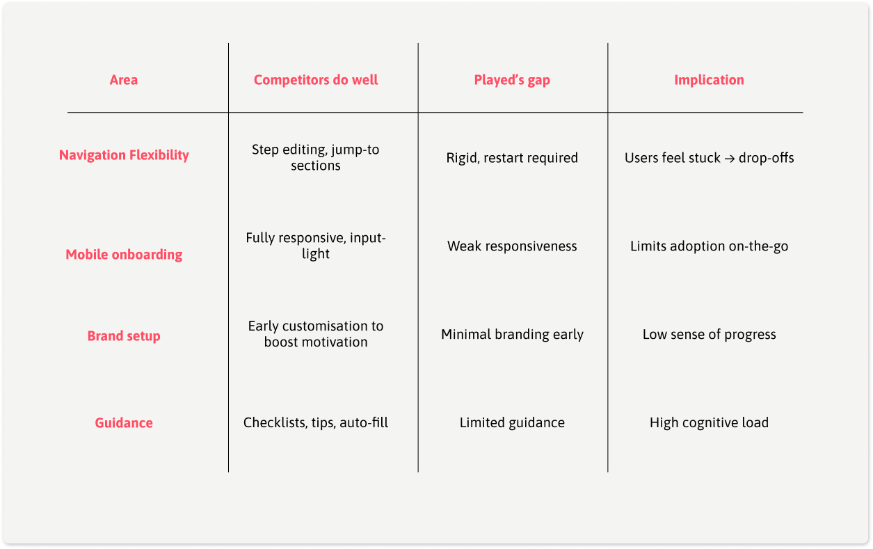
Competitive Insights
What Competitors Did Well:
Playtomic: Excellent mobile experience with progress saving
Clubspark: Flexible navigation allowing users to edit
Bookteq: Strong customization options
Where Played Was Falling Behind:
Rigid linear flow vs. competitors' flexible navigation
Poor mobile experience (critical for on-the-go providers)
Limited storefront customization options
Design Strategy: Focus on Flexibility
By linking user, business, and market insights:
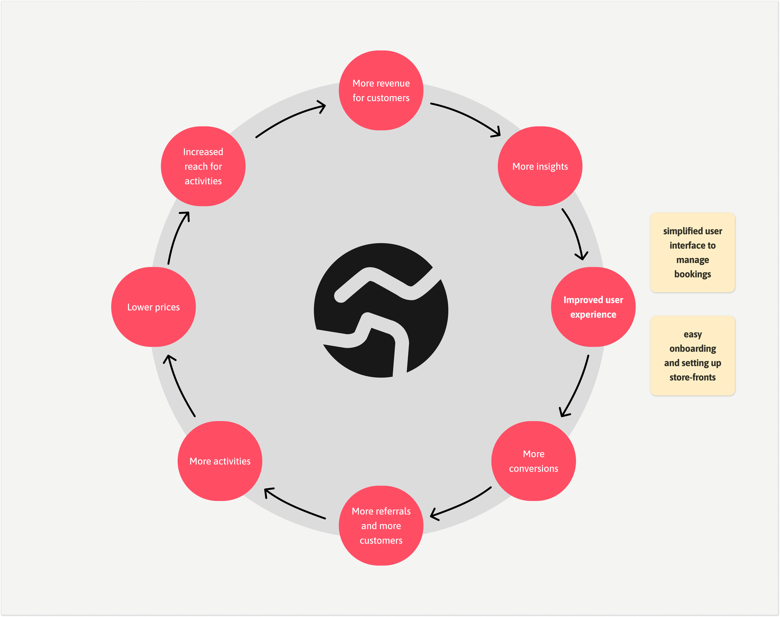
Streamlining storefront setup emerged as the highest-impact opportunity to strengthen the flywheel — improving UX → boosting conversions → enabling customer growth and more referrals.
By focusing on flexibility and mobile-first design, Played could differentiate in a crowded market while solving its #1 conversion bottleneck. While customisation preferences would be updated over time based on user feedback and adoption.
Streamline onboarding flow — Reduce setup time and cognitive load by simplifying steps and guidance.
Increase flexibility — Allow users to navigate back and edit inputs without restarting the process.
Enhance clarity and feedback — Improve form validation, visibility of inputs, and progress indicators.
Boost completion and adoption — Encourage storefront creation through a smoother, faster, and more intuitive experience.
Aligning user flow to accommodate flexibility
The revised user flow introduced flexibility with clear entry and exit points, allowing users to resume setup where they left off. Smaller milestones maintained motivation and reduced cognitive load, whereas and a review window improved clarity, and enhanced efficiency — ultimately reducing drop-offs.

Translating Research into Solutions
Research findings were translated into design actions that improved clarity, confidence, and motivation

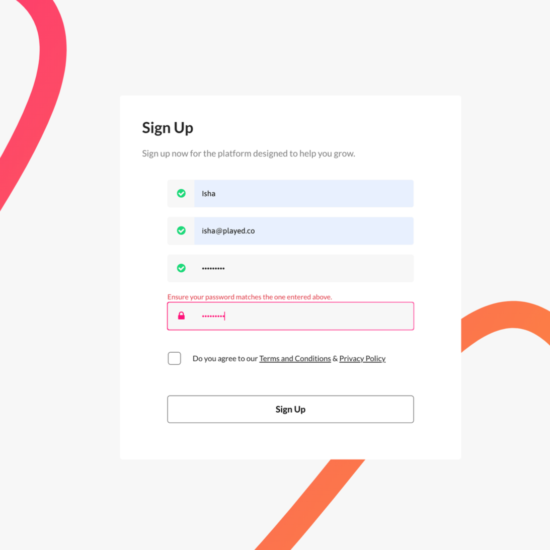
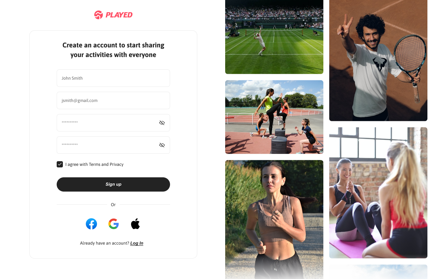
Enhance sign-up process by allowing password visibility, adding social sign-in options, and improving microcopy to reduce errors.

Adding a progress section on the top left of the Activities page will help users to easily navigate back to where they left off, avoiding frustration.

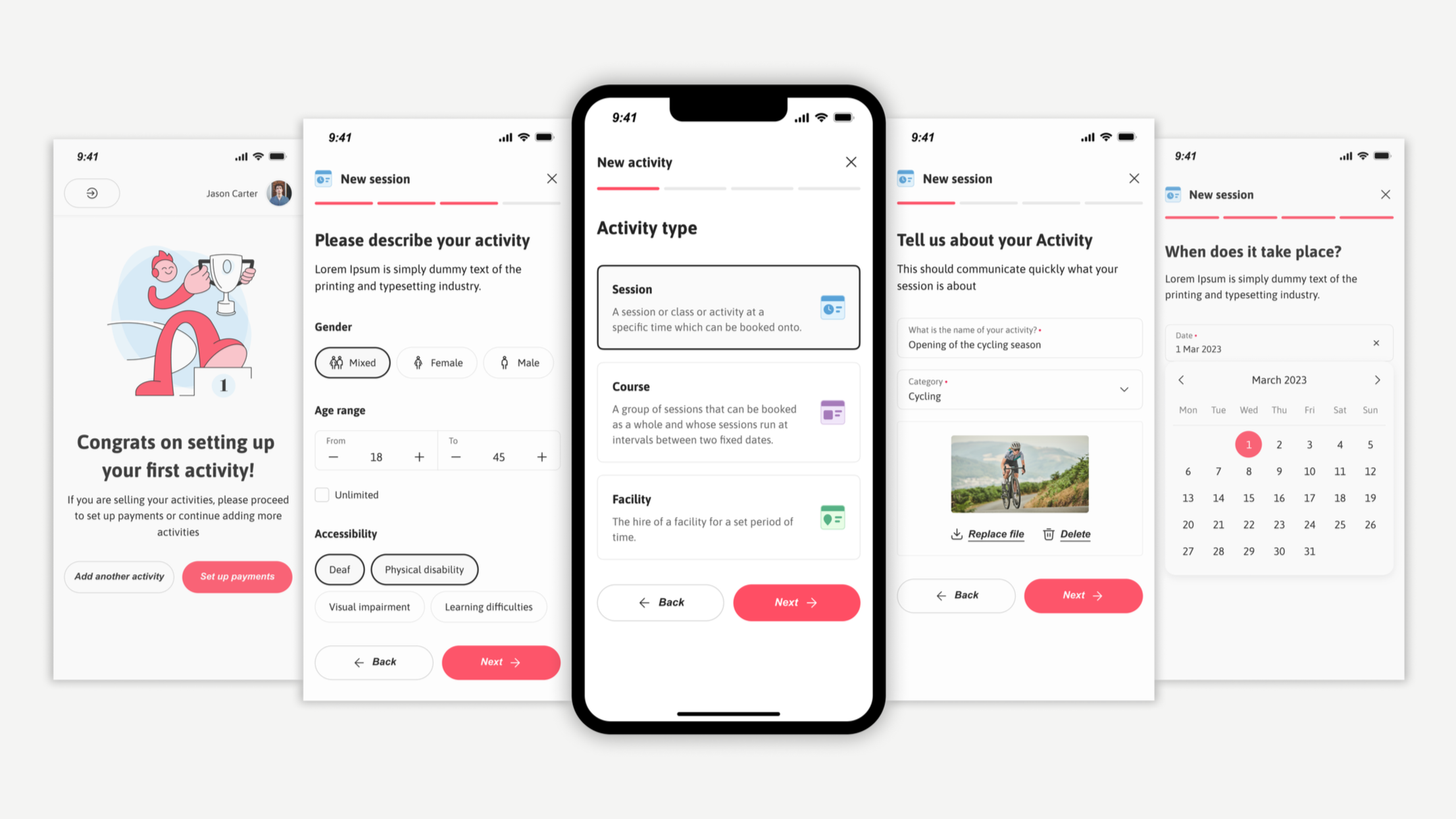
Implementing success screens after completing key onboarding steps will provide positive reinforcement to users and avoid abandoning flow.

Adding a preview section to help users confirm their selections and make changes, reducing overall time in decision-making and speeding up the onboarding process
Screens and interactions
The design was built using a newly established design system, featuring a refreshed color palette and visual language that strengthened brand identity while supporting key UX improvements across devices.
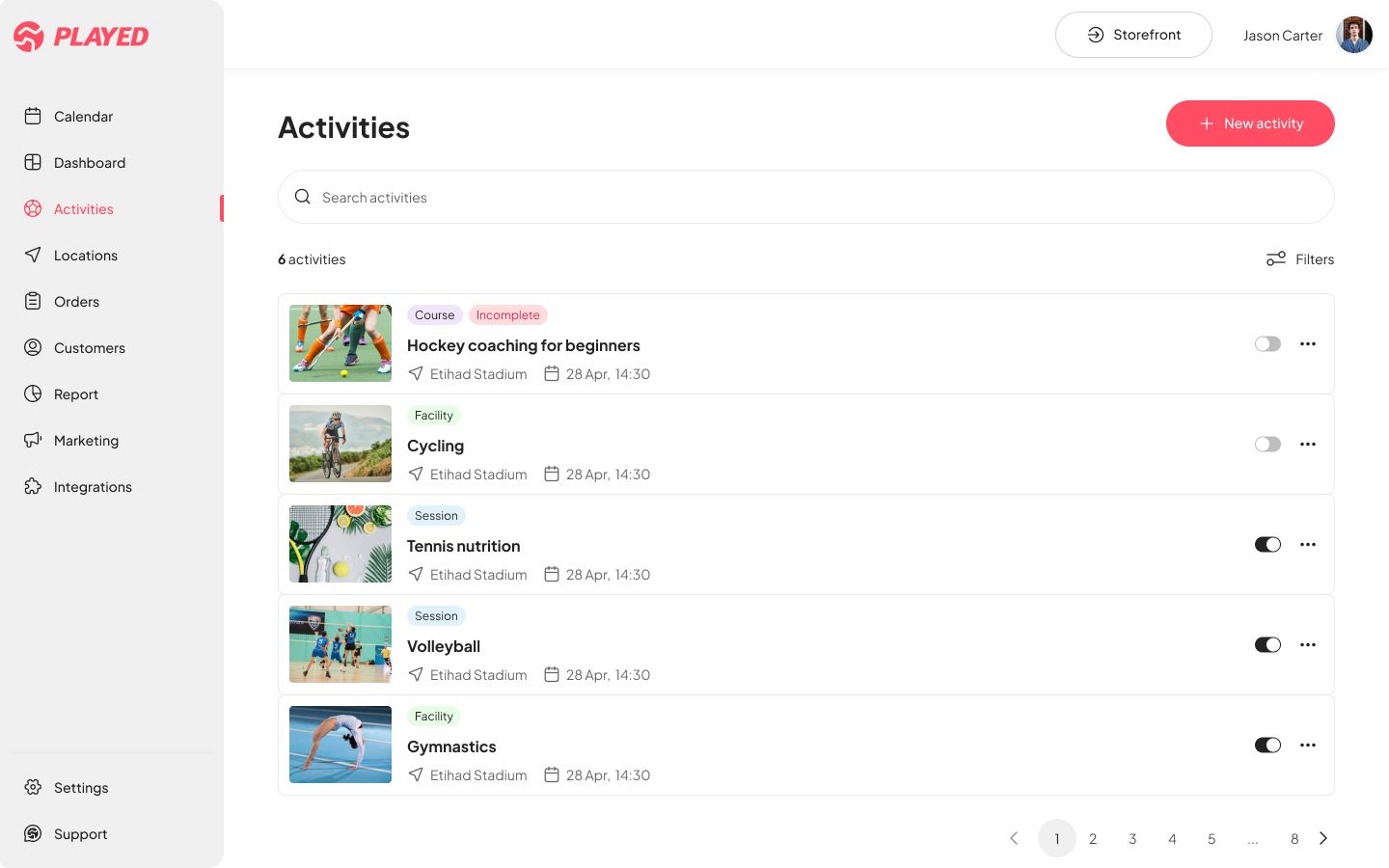


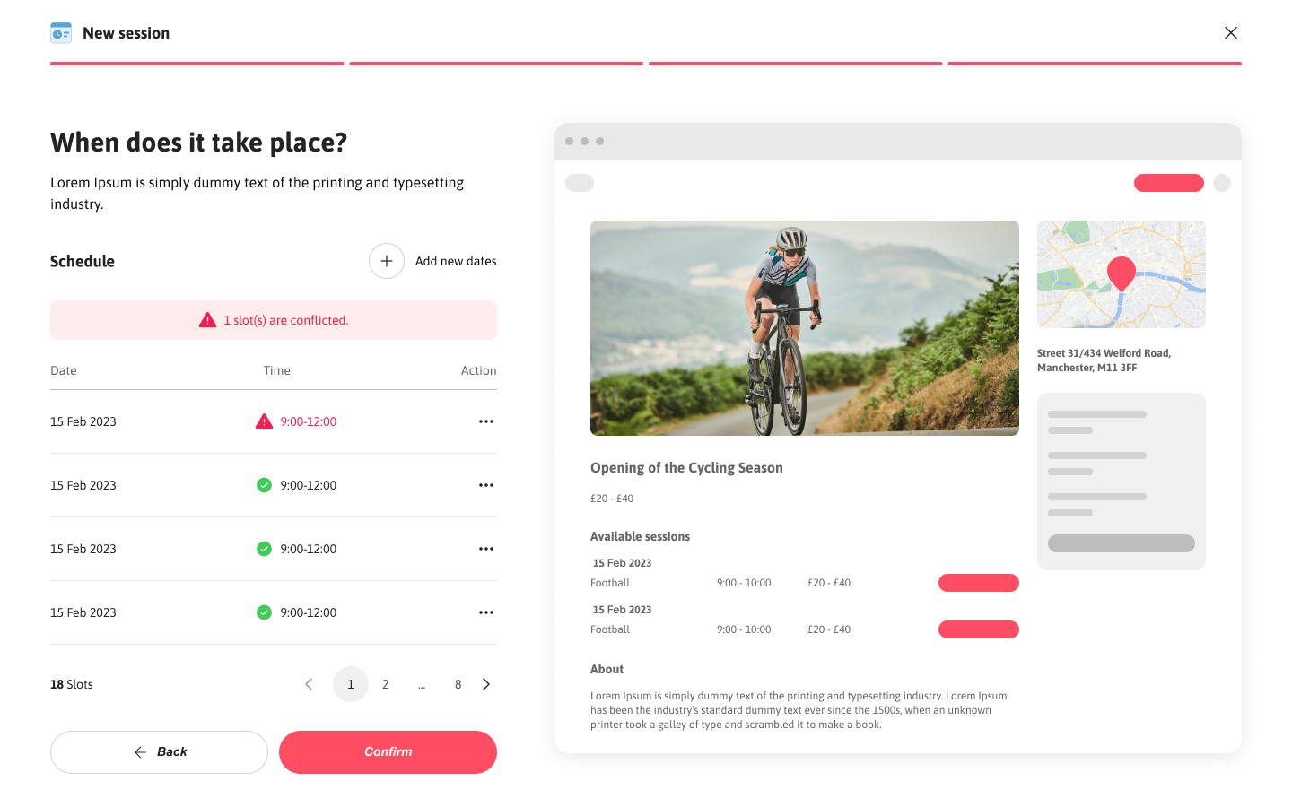

Users can save and continue journeys as needed, reducing cognitive load.
Users have the flexibility to go back to previous step and make quick edits.
Screens and interactions
While the primary onboarding and storefront management workflows were designed desktop-first—reflecting how most providers complete complex setup tasks—mobile responsiveness was considered throughout the design process. The mobile flow was structured using flexible layouts, scalable components from the design system, and consistent spacing rules to ensure a smooth transition across screen sizes.
Validating the solution
Testing Approach: Conducted usability testing with 8 providers (4 venue managers, 4 participation leads) using interactive prototypes.
Key Findings:
Setup time reduced from 30-60 min to 15-20 min average
100% of users successfully navigated back to edit inputs
Sign-up error rate dropped from 79% to under 10% in testing
Impact and Outcomes
The combination of streamlined flows, clearer feedback points, and stronger visual consistency proved effective in reducing drop-offs and encouraging adoption. Through usability testing and analytics tracking, key metrics showed clear progress at the end of 1 quarter from launch:
12% ↑
conversion rates
Users completed storefront setup faster and stayed more engaged during the onboarding flow
20% ↑
user satisfaction
Task success scores improved which was identified by in-app surveys and qualitative interviews reflecting a smoother, intuitive journey.
25% ↓
error rates
Users were able to sign up quickly and there was low abandonment during the process.
Key Learnings & Next Steps
The combination of streamlined flows, clearer feedback points, and stronger visual consistency proved effective in reducing drop-offs and encouraging adoption. Through usability testing and analytics tracking, key metrics showed clear progress at the end of 1 quarter from launch:
What Made This Successful:
Journey mapping revealed the exact bottleneck (storefront creation), allowing focused effort on highest-impact area
Balancing flexibility with guidance — users needed both freedom to navigate and clear next steps
Mobile-first thinking was critical for providers who manage activities on-the-go
What I’d Do Differently:
Test earlier — we could have caught some usability issues sooner with lo-fi prototypes
Run deeper segmentation by separating first-time users from returning admins to better tailor onboarding paths.
Test mobile-first flows parallely to ensure consistency and reduce late-stage compromises.
Future Opportunities:
Smart defaults based on activity type (reduce input fields)
Template library for common storefront types - Progressive onboarding (get users live faster, add details later)
Integration with existing booking systems (reduce manual entry)